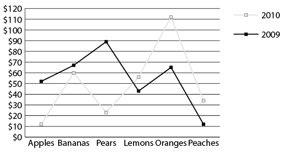
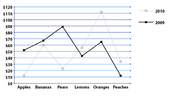
This is where we left off in the last step. Ick!
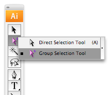
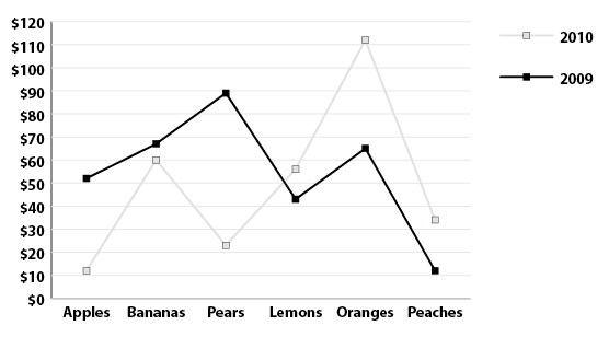
We really need to decrease the size of that text, change the font and maybe make it bold. You can select each individual word or number and make your changes one-by-one but that would take too long. Instead, take advantage of the Group Selection Tool in the toolbar, available when you click on the little triangle on the Direct Selection Tool:
With the Group Selection Tool selected, click once on "$110" to select it. Click again and it will select the entire column of numbers because when Illustrator creates your chart, it groups many of the text and graphic elements, making editing much easier:
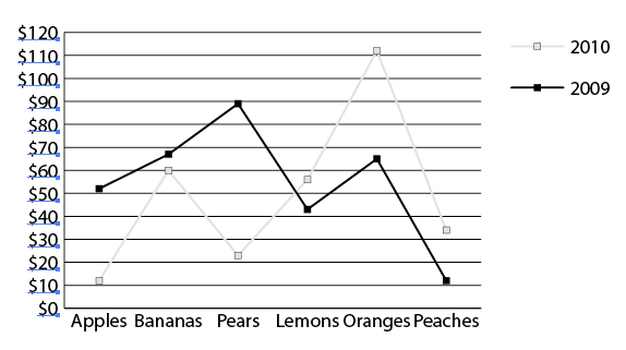
When you click once on "$110" and then click again to select the entire column, you can now change the font. I am going with Myriad Pro, 14 pt bold. You can change the row text and the Key text in the same fashion. Just make sure the Group Selection Tool is selected before you click on the text:
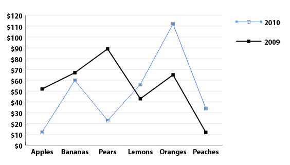
You can also edit your Tick lines. With the Group Selection Tool selected, click once in the middle of the top Tick line, and then click again to select all of the Tick lines:
I changed their Stroke from 100% to 10% black but you can colorize, thicken or do anything you want. The same is true for text. You need not stick to black & white:
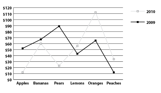
Here's one more amazing thing that you can do with the Group Selection Tool—you can have different Graph Styles within the same graph.
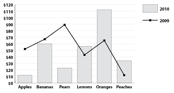
For instance, what if you wanted to have the 2009 data represented as a Line graph but the 2010 data represented as a Column chart. With the Group Selection Tool selected, click three times on the first line of the 2010 Line graph. This will select the entire 2010 line and the key line:
Now double-click the Graph tool on the toolbar (or go to the Object menu, scroll down to Graph and in the drop-down menu that appears, select Type) to bring up the Graph Type Window. Under Type, select the Column type icon (circled in RED) and click OK:
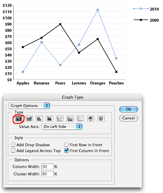
Your 2010 data will now be represented as a Column graph instead of a Line graph:
Keep in mind that you can edit color, line thickness, font style... pretty much whatever you wish using the Group Selection Tool and still be able to change your data in the Data Window (see Part I) later if need be as long as you do not Ungroup, although to be honest, I find that many times, ungrouping is often necessary in the end as a last step for minor but requested tweaks.