What is a halftone?
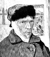
Halftones are used to reproduce continuous tone images, such as photographs, on a printing press. A black and white photograph, for example, is actually made up of black, white and infinite shades of gray. A printing press applies ink one color at time (per head on the press), and as such, it is not feasible to apply every shade of gray needed to create a realistic representation of the image. To compensate, printers have developed the process of halftoning where each individual photograph is reshot through a screen, resulting in an image composed of patterns of different sized dots that trick the eye into seeing continuous shades of gray:

Traditional halftoning techniques, however, are costly. Printers will charge about $8-10 per image to reshoot your photographs and create halftones. Through desktop publishing technology, however, anyone can now reproduce photographic images digitally (through scanning), edit and enhance the images (in Photoshop or any image editing app), and place the images as digital halftones in desktop publishing programs such as QuarkXPress and InDesign.
What is image resolution?
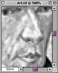
Once you scan an image, it becomes digitized—made up of hundreds of thousands of pixels. Pixels are nothing more than very tiny colored squares (there are 72 pixels in an inch) that you can see if you increase the magnification of any image:
Resolution is the number of pixels in a linear inch (i.e. pixels per inch or ppi) but is more commonly referred to as dots per inch (dpi). The more pixels, or “dots,” per inch, the higher your image resolution will be.
With color images, each pixel can be one of 16 million different colors (with a good scanner). For black and white images, there are 256 levels of gray pixels: 0 (black) through 255 (white). More pixels means higher resolution, which creates better image quality because you end up with more realistic representations of color, better gradations of both individual colors and gray tones, and crisper images in general. Here is the same image at 72 dpi and 25 dpi:
The most important thing to understand about resolution is the relationship between an image’s resolution (dpi), an image’s file size (measured in kilobytes or megabytes) and an image’s print size (width and height). There is much more on this in the Photoshop tutorial, Image Size and Resolution.
What resolution should I use for my images?
This is a frustrating question because it all depends on your final print output, and more specifically, what line screen frequency, better known as lpi, your commercial printer uses. Since most people pick a printer after their project has been completed, this can be tricky. Use a resolution that is too low, and you end up with poor quality graphics. With a resolution that is too high, you end up with longer process time and little gain on the overall quality of the halftone. There are, however, some typical line screen frequencies that are used as general guidelines:
- Newspapers or publications printed on newspaper stock use a 65 or 85 lpi.
- Books printed on uncoated stock use a 120 or 133 lpi.
- Books and magazines printed on coated stock use a 133 or 150 lpi.
- High quality books with lots of graphics (art books), calendars, etc. on coated stock will use 150 or higher lpi.
When determining resolution, the basic rule of thumb is that final image resolution should be twice that of your intended commercial printer’s lpi. So, for example, if you are creating a family history book with black and white images, you can’t go wrong with an image resolution of 300 ppi. However, 267 ppi is the most popular ppi for most book projects with grayscale graphics.
This rule does not apply to line art. Line art (clipart, charts, etc.) is best handled as an EPS graphic with a resolution of at least 600 dpi, and 1200 dpi is best. You can make halftones out of EPS line art but it really doesn’t make much sense to do so.
Which graphic file format is best for halftones?
Macintosh or PC/Windows, you can’t go wrong with TIFF format, and it is the preferred and the most widely supported image format.
What is dot gain?
Dot gain is when your halftone dots (pixels) swell as the ink is absorbed into the paper during the printing process. It can distort the final output of your images by making them appear darker and blurry. Dot gain can occur in a number of ways—printing press miscalibrations, poor paper quality and the general limitations of the printing process itself. There’s very little you can do to avoid dot gain, but there’s quite bit your printer can do at press time to compensate for dot gain. Most of the time, it is best to let the printer make the necessary adjustments to your page layout files.
When editing photos in Photoshop, keep in mind that midtones create the highest levels of dot gain, so if your midtones look too dark when you test print images from a laser printer, chances are that they will be even darker when they are printed on a press. The higher the lpi, the more dot gain. Newsprint and porous (rather than smooth) uncoated paper stock produce the most dot gain.